Flip & Floss
Industry Design Project
Project Type:
UI/UX Design
Date:
November, 2024
About:
Flip & Floss is an app to be used for parents to help their children learn financial literacy. Parents can assign courses and tasks that their children can do to earn either virtual Flipdollars or real money. Throughout the process, parents can learn more about their own spending and saving habits, thus strengthening their position in today's economy.

The Task
Flip & Floss is designed to allow parents to help their children to better understand their finances from a basic level of income and expenses to preparing them for entrepreneurship. While the idea was generating a great amount of interest, the users were frustrated once they were signed up for the app. The company then commissioned a usability audit to determine where the strengths were and what needed to be improved for better user retention.
The owner then approached our team to find viable solutions using the research from the usability audit while maintaining the purpose and goals of the company.
My Role:
This was a team project for a start-up company. As a team, we decided to break-down the components into areas where each would put their main focus and the others would support. My role was to focus on developing the design system while sharing input on design decisions.
Team Members:
Owner - Andre S.
UX Design Lead - Damani B.
Design Team - Leon L., Nova H., Andrew L., and Manda S.
Tools Utilized:
Figma, WebAIM, and Google G-Suite
The Kick-Off
The process began with a meeting of all parties where the current design and company goals were discussed. At this time, the owner shared the Usability Audit that the company had commissioned, as well as the existing Brand Style Guide. The major finding of the usability audit was that, once they were registered in the app, the user did not know what they should do from there.
In discussing the findings, the team determined three areas of focus:
1. Branding and Style - Improve the user experience by redesigning key features, implementing a modified color scheme, and developing a design system that can be utilized in the future to create additional features into the app.
2. Onboarding - Increase user confidence by incorporating an onboarding process that introduces the functionality of the app in a human-centered way.
3. Navigation - Implement a new navigation menu that brings all features of the app within a series of three steps, thus reducing user fatigue and increasing the user's confidence that they can easily find what they need.
The Plan
The design team then met to create a project plan that would identify the scope and timeline for completing the requested deliverables. It was determined that the best way to proceed would be to have main contributors for each component with the rest of the team acting as support. Benefits of this structure included:
- multiple components would be able to be designed simultaneously, increasing the amount that could be accomplished.
- the project was considered as a whole, rather than just as constituent parts created as a series.
- team members were placed in areas that would rely on their areas of strength.
Generating Ideas
Since the user feedback for this project had already been accomplished by another team, we designers were able to begin with brainstorming immediately and only really research how many other leaders of the financial industry addressed the issues we faced.
Industry Research
The design team looked at several industry leaders to find inspiration for design solutions. Money management apps Till Financial and Greenlight specialize in families with child accounts. GoHenry is a mobile banking app for children and teens that also includes allowing for task assignment.
Brainstorming
The team then focused on generating ideas for meeting the needs of the user and the company goals. In discussing color theory with the owner, the decision to incorporate new colors on neither the original nor brand style guidelines was made. This led to other design choices that incorporated more colors and visual aspects.
The Designs
At this point, the designs were created for the onboarding and authentication flow as well as the side navigation menu. At the same time, the new Design System was created for continuity across the app.
Onboarding and Authentication
The primary frustration of the users was that they did not know what to do once they had enrolled in the app. Users were dropped at a dashboard screen with nothing to do except try to figure it out on their own. With this being a financial education app, the end result made users uncomfortable with their experience.
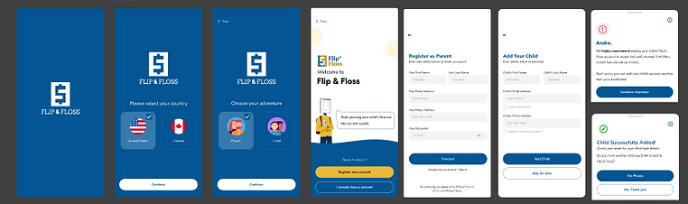
The Original Onboarding Process
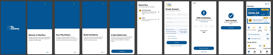
In our redesign, we focused on making the process feel much more natural. We shifted to using additional visual components that would allow users to recognize their selections more easily and created a tutorial that leads users through the processes of learning the app. This tutorial was also made available for users to access again, should they want a refresher on how the different components of the app worked.
The Redesigned Onboarding Process
The New App Tutorial Flow

Click image for scalable PDF
Side Navigation Menu
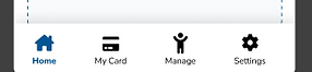
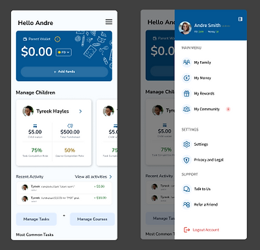
The original navigation for the app relied on the standard four-option bar at the bottom of the phone screen. This limited users in accessing additional features of the app, which would require additional steps to open a secondary navigation flow in order to reach those portions. By shifting to a drop-down side menu, the option to shift directly to another portion of the app was enhanced to include all of the apps features in a single menu that could be maintained as the app continued to develop. These features were then sorted into categories for ease in discovery.
Side Navigation Menu
Bottom Navigation Bar
New Features
The team developed several new features for the app, including sections to see the user's family as a whole, balances for money and rewards, a community newsfeed for users to connect, settings page, and legal policies. These features were tied directly into the app's side navigation menu so users would be able to transition to each section within two clicks.

Click image for scalable PDF
The Design System
The key to having a top notch user experience is providing a consistent design that meets the user's expectations in repeated actions. The pivotal aspect in providing this level of experience is having a design system in place that can be utilized in future iterations of design. In the beginning, the app did not have much of design system being used. There was a Brand Style Guide that had fonts and colors listed, but nothing that made the distinction of what was to be applied in a specified place or for a particular purpose. Throughout this process, we crafted a design system using all of the information and components that were utilized throughout the app. Colors were defined by name, hex code, and purpose. Typography was given font sizes and descriptions for use in copy. Components were collected and placed with all states for easy future use in new features. By creating this portion of the design file, we ensured that any upcoming iterations of the app would continue to meet the users' expectations.

Click image for scalable PDF
The Prototype
When time came to deliver the redesigned and updated app to the owner, he and his management team were quite impressed with the results. I think you will be, too. Feel free to check it out!

Clickable Prototype Link
Learnings to be Used in the Future
This project taught me a few things that I expect to use to better my designs in the future.
-
Having a team of designers allows for much more to be accomplished in a shorter amount of time by allowing each member to support the others with their unique strengths. While Leon and Nova took the lead in creating the onboarding, my experience in education was pivotal in ensuring a product that would meet the needs of users in a way that was more intrinsic to the learning process.
-
Working with members across four different time zones made for interesting collaboration. Making and keeping to schedules was essential, as others did not necessarily have time flexibility at the same points as others. Working in parallel on different aspects of the project allowed for a minimization of difficulties and proved the best solution all around.
-
Never be afraid to ask questions or make suggestions to the owner or their team. By asking the questions that needed to be answered in an asynchronous format, we were able to get the feedback we needed while we were continuing to work on other areas of the project. When suggestions were made about changes in colors for different parts of the app, having a sound understanding of the concepts involved helped the owner to make an informed decision that worked best for his design goals.