Tiny Tales
A Modified GV Design Sprint
Project Type:
UI/UX Design Modified Design Sprint
Date:
July, 2024
About:
Tiny Tales is an innovative, tablet-based library app designed for parents and caregivers of children aged three to nine years old. It offers a selection of engaging and educational stories that can be accessed anytime, anywhere, making it convenient for busy families to enjoy quality reading time together.
While GV (formerly Google Ventures) has provided many design sprints for designers to help hone their craft, Springboard and BiteSize UX have modified it to create opportunities for students to learn the process while working as a team of one. Thus, while the process is predominantly the same, there are fewer pieces that are put into the final product than there might have been had it been a full design sprint.

The Premise
Tiny Tales is a start-up with an all-in-one application for parents to find stories to read to their children. They want to make it easier for parents to find those stories, and are conducting a design sprint to produce a solution for this challenge. During this process, all research, goals, and background information was provided by the company prior to beginning the sprint.
My Role:
My role as the sole designer on the team was to delve into the user research provided, develop and ideate the solution, and perform user tests to ensure that the final product worked smoothly.
Tools Utilized:
Figma, FigJam, Google G-Suite, Mobbin, and Zoom
The Process
As a design sprint, the process of designing this app was significantly streamlined from the iterative process used in other. In five days, the product went from concept to testing.
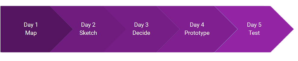
Day 1 - Map
Day 1 focused on understanding the problem and mapping a possible end-to-end user experience that solves the problem. In order to do this, research was analyzed and the key thoughts and feelings of its users.
Deliverables:
Affinity Map, Persona, Design Map
Provided Research and Affinity Map
The research data that was provided by the company included excerpts from user interviews, one full user interview audio recording, and information for a persona. The research showed that parents were focused on ease of finding stories that fit their various criteria - from topic to reading level and on to what other parents thought of the story. By performing analysis and creating an affinity map, the major themes became clear: parents wanted stories that their children would find engaging while having multiple ways in which to find new stories that would continue that engagement.
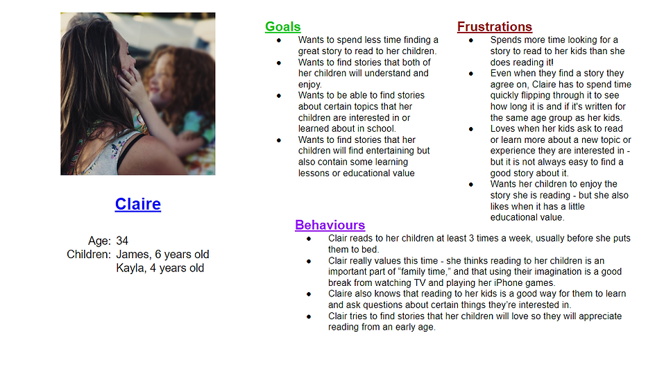
Persona
Design Map
Once the affinity map and persona were established, a design map showing an end-to-end user flow was created. Focus was placed on finding stories that fit the criteria of the user, so the assumption was made that the user would have already created an account and user profile prior to this flow.


Day 2 - Sketch
Day 2 focused on finding possible solutions to the problem that was identified on Day 1. The key pain point of the users was finding the stories, so that was the screen that was in the spotlight for this portion of the design sprint.
Deliverables:
Lightning Demo, Crazy 8's, and Solution Sketch
Lightning Demo
While traditional design creates mood boards and does competitor analysis of other applications, the lightning demo is the streamlined process for a design sprint. Amazon, Audible, Netflix, and Walmart were key apps that were viewed for the way they provide additional information about a product. Walmart, Deel, TripAdvisor, Circle, and Buy Me a Coffee were viewed for their rating systems. Chandler Public Library, Nike, Google Images, Deel, and Vooks were viewed for other miscellaneous attributes that would influence the processes in the app.
Crazy 8's
A process called Crazy 8's was used to quickly iterate multiple possible solutions for the main feature of finding a story using the Tiny Tales app. Instead of eight completely different solutions, the speed of the Crazy 8's process, in this case a thirty minute time limit, mandated smaller variations on a similar theme. Focus was placed on a single screen, and the process of filtering and providing information for parents to use was at the core of the designs.

Solution Sketch
After looking at the eight design sketches created during the Crazy 8's process, one was chosen as the best possible idea to use as the basis of the solution. At this point, a sketch was created with the chosen solution as well as the screens immediately prior and after the solution screen. In this way, context for the process was introduced and allowed for a clearer picture of how this solution would fit into the process outlined in Day 1's design map.

Day 3 - Decide
Day 3 focused on deciding on the solution to the problem that best fit the needs of the user. Since this was a modified sprint using a team of one, the solution sketch from Day 2 was the solution that was developed further on this day.
Deliverables:
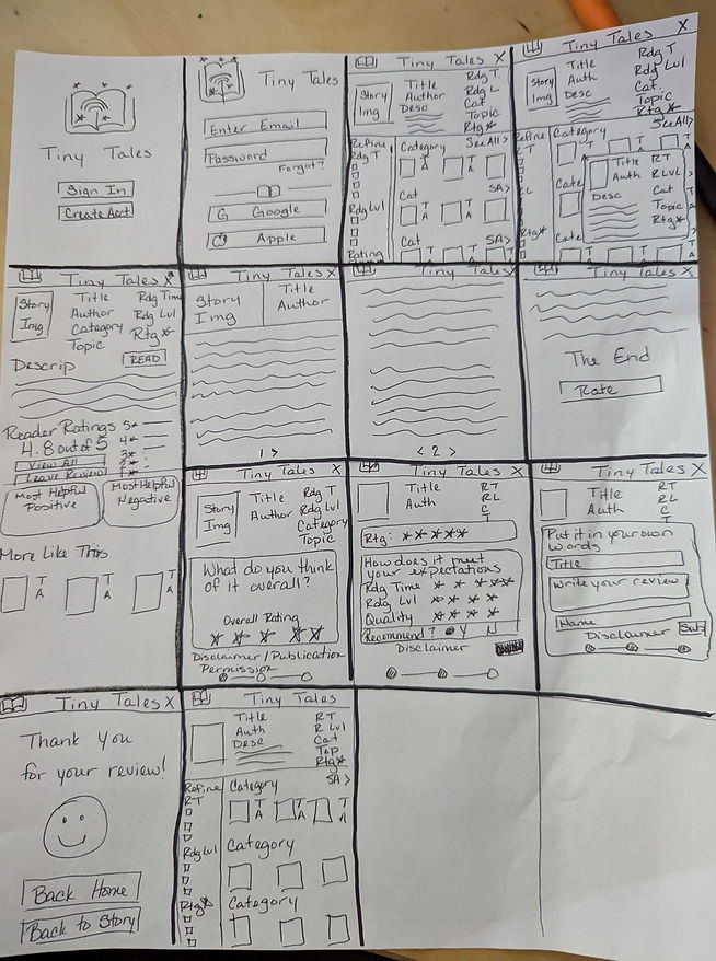
Storyboard
Solution Storyboard
This is where the solution sketch was expanded to include the entire flow from Day 1's design map. As design sprints only include the parts of the design integral to performing the tasks needed to solve the problem, there was no account creation process sketched out, as the assumption remained that it would have been done prior to this point. While creating the 13-panel storyboard, it was determined that two additional screens were required between the first two panels of the solution sketch to make the flow coherent. Also, the decision to include the process for rating a story was made, as it was an essential part needed for obtaining the information that would be provided to parents as part of the solution.
Day 4 - Prototype
Day 4 focused on bringing the storyboard to a point of usability for testing. Again, the process was limited to the storyboard and design map elements.
Deliverables:
Prototype on Figma
Design Choices
In his book Design Sprint, author John Zeratsky explains that the prototype for a design sprint should be “a realistic façade” to test with users. Therefore, design choices were important for users to get a true feel of the app. This included font styles and sizes, colours, icons and imagery that would be used to make the app feel substantive.
The logo, app name, and primary color were all gathered from the information provided in the GV Tiny Tales scenario. From this start, variations of the purple color were selected for use as the primary hue in the app. The secondary color was selected by using its complementary color, yellow. Accents, icons and images were selected based on appearance, contrast, and tone to make the feel of the app authentic as a family-centric app.


Day 5 - Test
Day 5 was set aside for user testing of the prototype. Due to the proximity of a national holiday, this actually occurred over three days.
Deliverables:
Usability Test Report
User Testing
User testing consisted of five individuals who have small children they read stories to on a regular basis. All had similar feelings toward finding books as the original research - they felt that they spent more time searching for a book or story to read than it took to read the story, which actually left them with less time to read to the children.
Upon starting with the app, users were asked their first impressions of the landing page and home screen. After that, they were asked to perform two tasks - find a story about animals to read their 4 year old child, and then refine their results to a story of less than 10 minutes. After describing their thoughts on the resulting story's information page, they were asked to perform a third task: to "read" the story and then rate it.
In the end, five errors were uncovered - one critical, three major, and one superficial. All were addressed after the usability testing was completed.
The Updated Prototype
After fixing the errors found through usability testing, a few cosmetic changes were also made. The prototype is now ready for delivery! While further iteration would be required to make a fully functional app (account creation and such), please feel free to check out the clickable prototype!

Clickable Prototype
Learnings for Future Use
Participating in this modified design sprint allowed me the opportunity to view the experience at a much faster pace than that of my first design project. Here are a few things I learned and will use in the future.
-
Design sprints are amazing in what they produce in such a small period of time. This allows for ideas to be generated and saved for future use, even if they were not the solution selected for development. It also minimizes the stakes when making bold design decisions, as it only antes a week's worth of time.
-
While I chose to digitize several of my deliverables - the design map and affinity map for this case - working on paper enabled me to make quick decisions and reorganize things much more quickly than had I been solely working digitally.
-
While remote testing is great for usability testing from the perspective of connecting with users and recording the session, it can have its own set of issues. Having users in person and using the prototype on an actual device eliminates issues like different screen sizes and operating system functionalities.
-
When selecting users for usability testing, users with a background in UI/UX will give you a completely different perspective than users with no design background. Having a mixture of both is much better than having only designers in your panel.